Rai Rebrand
Based on the square shape from the logo, we developed a contemporary visual identity that unites Italy’s largest network across its four primary channels, Rai 1, 2, 3 and 4, while also celebrating each one’s unique personality.
Taking cues from artists in the modernist tradition such as Max Bill, Josef Albers and especially, Italy’s own Bruno Munari, we put a charge into the Rai square, making it twirl, spin, dive and dart through an array of bumpers, lower thirds, end pages and other elements. Along the way, we created rules for the square’s motion depending on the channel it was appearing on.
Taking cues from artists in the modernist tradition such as Max Bill, Josef Albers and especially, Italy’s own Bruno Munari, we put a charge into the Rai square, making it twirl, spin, dive and dart through an array of bumpers, lower thirds, end pages and other elements. Along the way, we created rules for the square’s motion depending on the channel it was appearing on.

Rai 1
It is the most-watched TV channel in Italy, showing everything from news to sports to soap operas. To tap into the daily comfort it provides viewers, we kept the animation safe and secure. Wherever it’s headed in Rai 1, the square, like a rook in the game of Chess, always moves along vertical or horizontal lines.


Rai 2
On the other hand, Rai 2 mixes things up a little, adding a narrative edge to its programming slate of series and movies. With the added depth, we deepened the movements of our square, angling it to make it a diamond or growing it into a cube to evoke a new dimension of viewing.
On the other hand, Rai 2 mixes things up a little, adding a narrative edge to its programming slate of series and movies. With the added depth, we deepened the movements of our square, angling it to make it a diamond or growing it into a cube to evoke a new dimension of viewing.


Rai 3
For Rai 3’s thoughtful blend of cultural commentary and current affairs, we removed the predictive element of our square’s angles and rotations. Like discourse itself, you never quite know where the square’s going to go in Rai 3 – the fun is in watching it go there.


Rai 4
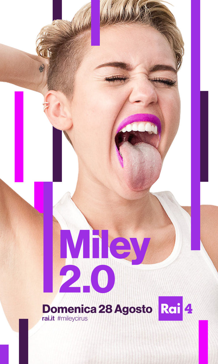
Last but not least, we deconstructed the square for Rai 4, finding beguiling new ways for it to materialize and come apart as it shows off youth-oriented fare such as sci-fi, fantasy, anime and other content.


Abstractly evoking four separate yet interconnected network personas was a big challenge. But by staying true to our endlessly expressive little square, we found a way to do it, bringing a new Rai identity into Italian homes that is simple, strong, and open to all ages. After all, as Bruno Munari once said, “The square is as high and as wide as a man with his arms outstretched… It signifies the idea of enclosure, of home, of settlement.”


